Text reveal with clip path
There is this effect where you can use clip path to reveal a text (or any other element) by tracking the mouse position and revealing some other form. I wanted to explore how this effect is done and how we could implement it.
Attention!
Attention!
This article is better read in a device that has a pointer so that you are able to hover over the text. If you are on a device without a pointer, you can click on the text to see the desired effect.
How it’s done
The main idea behind this idea is to have two layers. One layer performs the initial display while the bottom layer is displaying the second portion
Bruno
Bruno
Now that we have these two layers positioned on top of each other, we can use clip-path to create our “mask”.
How clip-path works
In [Part 1] Building mountains: CSS’s clip-path I go a bit deeper on how clip-path actually works but for this effect we only need to know that clip-path hides certain parts of an element.
clip-path: inset() hides elements by cutting away edges from all four sides. You give it values for top, right, bottom,
and left, only the area inside these boundaries shows. For example, inset(50% 0% 0% 0%) hides 50% from top:
clip-path: inset(0% 0% 0% 0%)
Now that we know we can hide a certain element using clip-path we can apply the same logic by having two layers,
and when hovering over the element, we can hide half of one element while displaying the other
The math behind tracking the line
The tricky part isn’t the clip-path. It’s converting a mouse position into the right percentage. Two coordinate systems are at work here, and the reveal only lines up if you switch between them correctly.
Mouse position
The mouse move handler gets the cursor’s Y position relative to the container. You turn that into a percentage of the container’s height, then clamp it so the line stops at 10% and 90% (otherwise it looks like the text just disappears)
const mouseY = event.clientY - containerRect.top;
const percentage = Math.max(10, Math.min((mouseY / containerRect.height) * 100, 90));
This percentage positions the tracking line with top: percentage%.
Line position
Here’s the catch: clip-path’s percentages are relative to the
element being clipped, not the container. Our text (z1/z2) is centered and shorter than the
container, so “50% of the container” and “50% of the text” point at different heights. If we clipped using
the container’s relative percentage directly, the line and the reveal edge would drift apart as soon as the
text’s box did not match the container’s.
To fix that, we re-measure where the line actually landed (in viewport pixels, via getBoundingClientRect)
and re-express it as a percentage of the text’s height
const relativeLinePosition = ((lineRect.top - z1Rect.top) / z1Rect.height) * 100;This subtracts the text’s top position from the line’s top position (that’s how far down the line sits), then divides by the text’s height to get a percentage the text understands.
Now we use that percentage in both clip-paths
z1.style.clipPath = `polygon(0 0, 100% 0, 100% ${relativeLinePosition}%, 0 ${relativeLinePosition}%)`;
z2.style.clipPath = `polygon(0 ${relativeLinePosition}%, 100% ${relativeLinePosition}%, 100% 100%, 0 100%)`;
z1 keeps everything above the line. z2 keeps everything below it.
The line always lands exactly where you see it, no matter how the text is sized or positioned inside the container.
<div class="wrapper">
  <div class="container" data-container>
      <div class="tracking-line" data-tracking-line></div>

      <h2 class="text z1" data-z1>Bruno</h2>
      <h2 class="text z2" data-z2>Bruno</h2>
  </div>
</div>
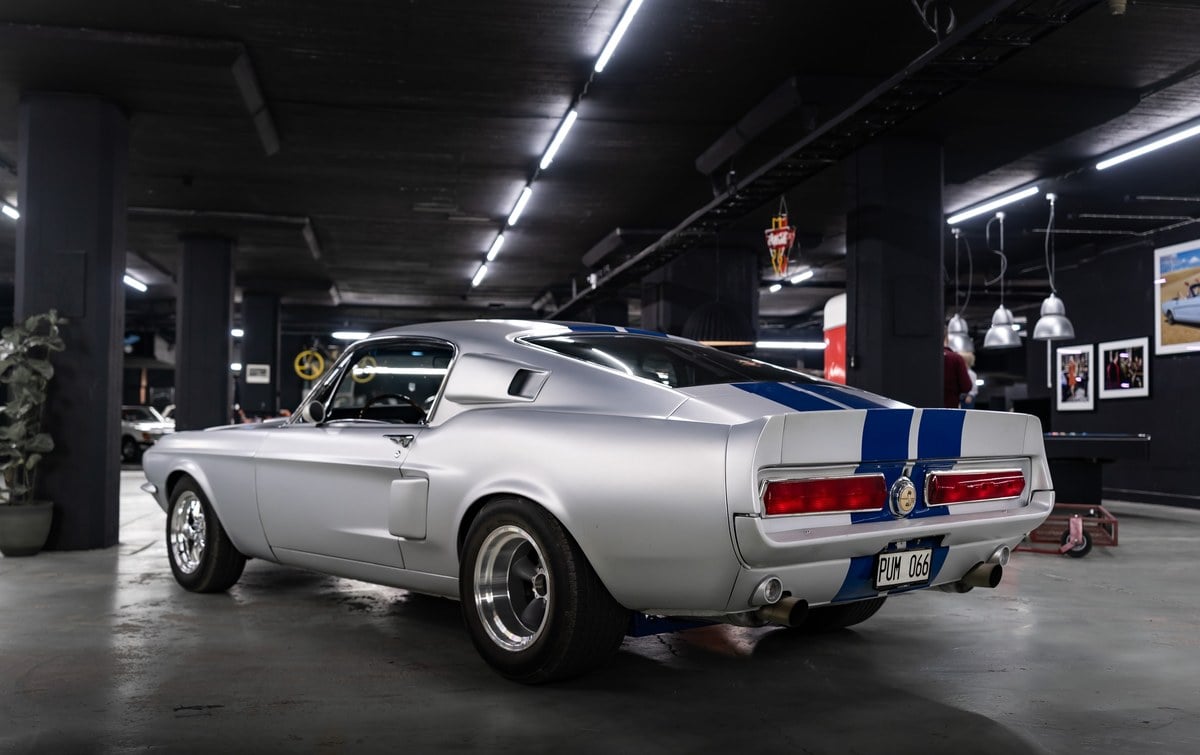
One more usage of clip-path is to switch between images and create this simple effect
Which cars would you like to drive today?

Attention!
Attention!
The animation above uses @keyframes which are not interruptable. If you click between “Ferrari” and “Ford” fast enough, you will see it breaks the effect. In order to make it look nicer, you will need to use transition since it’s interruptable.